


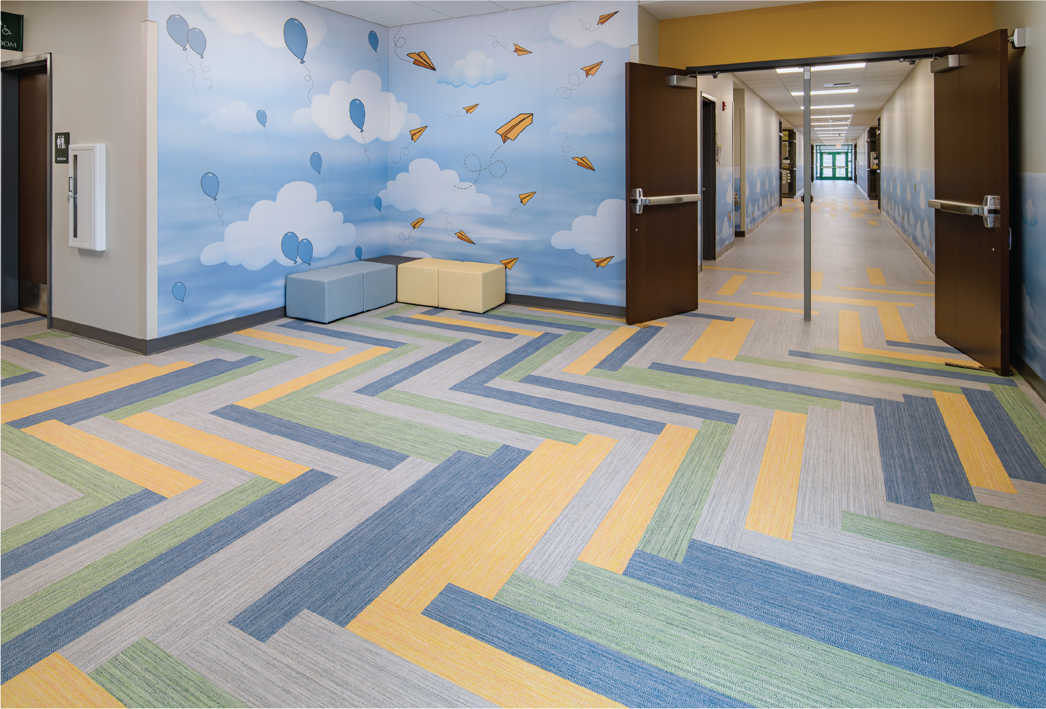
People-centered design is more than a philosophy; it’s an approach that acknowledges that every aspect of a learning space communicates something to its occupants. From the layout of furniture to the presence of collaborative zones, from natural light to color on the walls, these details are not secondary to the curriculum — they actively support the curriculum and can augment the teachers’ overall impact.
As Dr. Lennie Scott-Webber, a pioneer in exploring how place impacts learning, reminds us, “teaching is work. Each discipline has particular needs, tools, equipment, language, and it all takes time to put lesson plans and teaching strategies together.” If teaching requires intentional design for complexity, collaboration, and preparation, then student learning does as well. Both students and teachers thrive when their environments are designed to reflect the work they are doing.
This is where color becomes one of the most powerful, and underutilized, tools for people-centered design. Unlike large-scale renovations or costly technology upgrades, color is both costeffective and durable.
Design decisions should start with the intended purpose of a space according to research by Kathie Englebrecht of Perkins+Will. Color choices should prioritize functionality, not simply aesthetics or trends.
How Color Can Positively Impact Student Performance
Research across multiple disciplines — from psychology to education to environmental design — demonstrates that color affects not only mood, but also measurable academic outcomes.
Warm colors sharpen comprehension. Light yellows and oranges have been shown to enhance students’ ability to absorb and recall material. In contrast, neutral tones such as gray or beige produce weaker comprehension results.
Green restores attention. A University of Melbourne study revealed that even brief exposure to green can improve focus. In the study, students who took a break by looking at a green rooftop performed significantly better on a tedious task than peers who looked at a gray one. This aligns with “attention restoration theory,” which highlights green as a color that refreshes the mind.
Blue promotes calm and focus. Blue tones are particularly effective in spaces that require sustained concentration, such as math or science classrooms. Students in blue-toned rooms report feeling calmer and show improved ability to complete tasks with accuracy. Age-dependent preferences matter. Younger children respond more positively to bright, bold colors such as red, pink, and blue, while older students gravitate toward cooler, subtler shades such as green and blue.
These findings echo Scott-Webber’s Four A’s framework — Archive, Active, Array, Await — which describes the types of workspaces teachers need to prepare, collaborate, and deliver content. Just as teachers need spaces that align with the rhythms of their work, students need environments where color reinforces the type of learning expected. A library painted in soothing greens and blues encourages focus and reflection, while a makerspace with splashes of orange and yellow sparks collaboration and creative energy. In both cases, color choices directly support the pedagogical goals of the space.
As Scott-Webber suggests, focusing solely on the students is not the only thing to consider. We must also, in tandem, think about the teacher centered design that complements students as this is their workplace as well. Students first, while also considering teachers.
Teachers are sometimes crammed into small offices with little room to plan or collaborate. The same principle applies to color: if schools think intentionally about how colors shape student learning, they should also consider how colors impact teacher workspaces, encouraging productivity, reducing stress, and supporting professional collaboration.
Color Transforms Learning
Color is often seen as an afterthought in design — the final decision made once the architecture is complete. But research tells a different story. Color is not a finishing detail; it is a foundational element of people-centered design.
From sharpening comprehension with warm tones to restoring focus with green, from energizing collaborative spaces with orange to calming math classrooms with blue, color has a measurable impact on student performance and well-being. Case studies from across the U.S. confirm that when schools align color with function, they create environments where both students and teachers thrive.
As Dr. Scott-Webber reminds us, both teaching and learning are forms of work — and both deserve environments designed with intention. Color is one of the most accessible and effective tools to make those environments more human, more functional, and more inspiring.
The evidence is clear: when we view color not simply as decoration but as an active participant in pedagogy, we begin to realize its full potential to transform learning.
Examples of Color Used Well in Schools
Across the country, a number of schools have embraced intentional color design with remarkable results. Color functions not just as decoration, but as an educational tool. Both of these examples demonstrate a principle of people-centered design: when color is aligned with function, it becomes a silent partner in the teaching and learning process. The colors communicate to students what to expect, how to behave, and how to engage — all without a word being spoken.
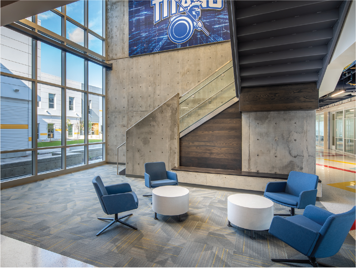
Career Tech High School embraced color as a way to connect with the surrounding landscape while also supporting wayfinding. Colors helped orient students as they moved through the building, reducing confusion and creating a sense of belonging in the larger environment.
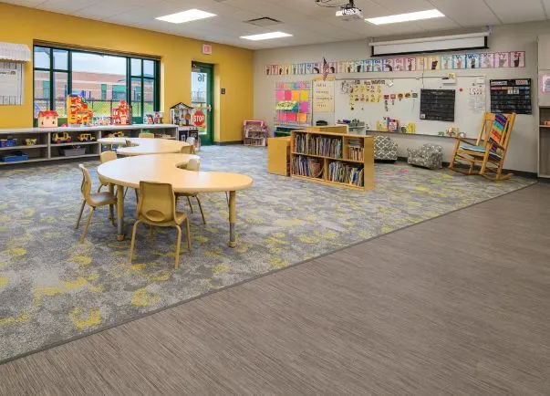
At Westfield Washington School, careful consideration of color was also important as research shows warm colors like yellow help young children focus and strengthen memory, making it easier for them to absorb and recall new information.